
Get into your graphic designing mode with these ten useful tips
By, Aylia Naqvi
Whether you’re creating social media graphics or making educational infographics for an academic endeavour, knowing the basics of graphic design is a transferable skill that will be indispensable in any and all pursuits. When done right, design has the capacity to visualize facts, tell compelling narratives and make information more digestible for a mass audience.
But to achieve this, you first must understand key elements like typefaces, colour contrasts and negative space, as well as know-how to best use practice as multifaceted as graphic design to your advantage. Here are 10 design tips to help you through your design process.
1. White space

(Aylia Naqvi/CanCulture)
When making graphics, don't be afraid to have negative space. This will bring more balance to the composition of your graphics. Unless it lends to the ultimate goal of your design, too many elements can be overwhelming for a consumer, making the information you’re trying to relay insignificant. Canadian graphic and branding designer, daniellelabontedesigns incorporates many white spaces in her graphics, which lead to her designs not only being easy on the eyes but also easier to understand. Looking more into her work, one can take notice that LaBonté’s graphics having a lot of negative spaces make the information on her graphics look more emphasized.
2. Limit your colour palette
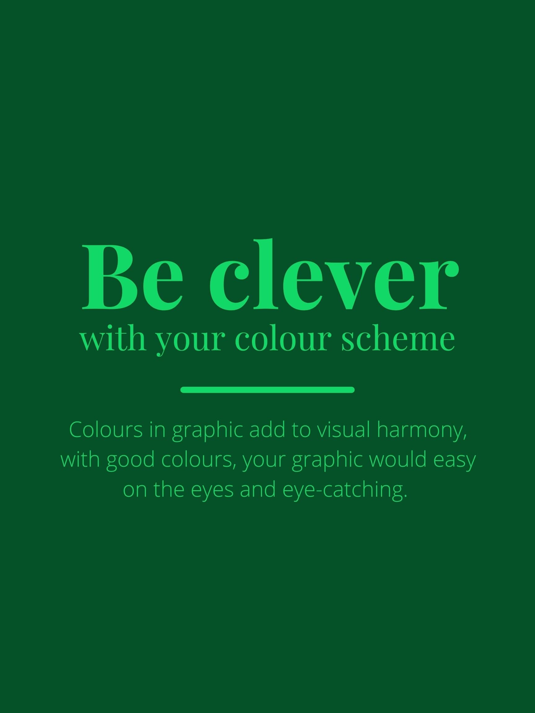
The right colours in graphics can create visual and palpable harmony, which is why it's important to choose colours that complement each other. Select one to three primary colours and one to three secondary colours that compliment and contrast each other. Also, using the same colour but in different shades can be an effective way to get an aesthetically pleasing composition. If you’re unsure of what colours pair well together, draw some quick inspiration from online tools like Coolors with a plentiful cache of premade palettes. Studio.millie are a team of graphic designers and writers who are very unique with their colour schemes, by using purple, gray, and green, their colours give off a softer and velvety feeling to them. Studio.millie, a Toronto-grown agency, has proven that a good colour scheme can definitely create visual harmony in your work, by choosing colours that not only radiate off each other, but also stand out on their own.
(Aylia Naqvi/CanCulture)
3. Limit your typefaces and stay consistent

(Aylia Naqvi/CanCulture)
When selecting a font or typeface for your heading, subheading or body text, it’s important to make sure you stay within the same font family for an effective design. The human eye has a harder time when it’s forced to scan and translate multiple typefaces, so stick to a small collection. If you’re wondering how to pair two fonts together, look no further than FontJoy, an online resource that allows new designers to combine fonts together. This helps to create an aesthetically pleasing and coordinated pair of fonts that are guaranteed to bode well on any platform.
(Aylia Naqvi/CanCulture)
4. Create hierarchy of information
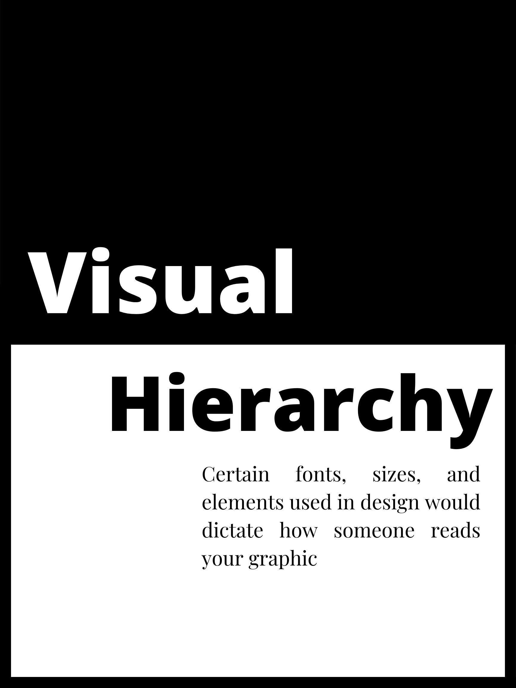
When a graphic contains specific information that you want onlookers to absorb, ensure that the most visually dominant aspects featured in your content are also the most important.This could be done by coupling the most critical information with a larger font size, bold lettering, contrasted colouring and a centred alignment.
(Aylia Naqvi/CanCulture)
5. Keep it simple

Make sure that every element of your graphic has a reason to be there. You don’t want your fonts, visuals and background designs to be overbearing. When it comes to visualizing facts, prioritizing easy navigation over aesthetics will invariably create more accessible work for your audience.
(Aylia Naqvi/CanCulture)
6. Contrast is key

To enhance visual harmony and ensure that your work is accessible for all audiences, use contrasting colours within your graphics to make certain elements pop. If you’re unsure if your text and background colours are lacking contrast, test them out on WhoCanUse, a tool that highlights how colour contrasts can affect different people with visual impairments. Aim for an AAA grading with your palette to ensure optimal accessibility.
7. Brighten your graphics

While it might seem daunting to use bright colours in graphics, it's a great way for your message to be seen and for your visualizations to stand out amid a sea of monotonous palettes. WhoCanUse, is a great tool to also explore the brightness of your graphic to make sure they are not too jarring or too dull for the eye.
(Aylia Naqvi/CanCulture)
8. Always think about your target audience

Unless you are making designs for yourself, you need to understand who you are making it for. With this, sometimes you are going to have to step out of your comfort zone to please your audience. While this could be overwhelming, it is a great way to explore your creativity and skills.
(Aylia Naqvi/CanCulture)
9. Icons, icons, icons
Most notably being used as visual symbols in infographics, icons are a great way to help bring in a design aspect to your graphics. Icons can include images that are easily recognizable, like houses, phones or pencils. Icons are also a great way to get your message across from a visual perspective for those who learn better visually.
10. Have a mood board

It is completely normal to have moments where you blank out and feel uncreative. With this, you can benefit from sketching out graphics on a notepad and exploring what makes you feel creative. Experimenting with colours, icons and fonts are all great ways to get your creative juices flowing, and seeing all your ideas in one place can help you come to a decision.