Connecting Music and Art: Exploring Canadian Album Artworks

 Check out the evocative artwork behind some of Canada’s greatest tunes

By Sharon Arulnesan

A collage of album artworks

Learn about some of Canada’s most iconic album artwork. (Sharon Arulnesan/CanCulture)

While listening to your favourite song, have you ever glanced at its album cover and wondered what the connection between the song and the artwork could be?

Often seen as supplementary to the music itself, album artwork has a dual purpose: to captivate listeners and for the musician to tell a visual story of what their music represents.

Many album covers have stood the test of time and are still viewed as some of the most iconic album art of all time. Music listeners, even the most casual, are sure to recognize Pink Floyd’s The Dark Side of the Moon's simple, yet symbolic, glass prism featured on the album cover, or the controversial baby swimming towards a dollar bill on Nirvana’s Nevermind.

Canadian musicians are no strangers to experimenting with, at first glimpse, offbeat artwork—that actually has an individualized meaning to the musician. From rock to folk to psychedelic R&B, these Canadian album covers all have a fascinating story to share.

Clouds by Joni Mitchell

Mitchell’s 1969 Clouds album artwork (Clouds via Amazon)

The Canadian folk singer Joni Mitchell has a career spanning decades of genre-shifting music, setting the stage for Canada’s alternative music scene.

The Clouds album artwork is a self-portrait of Mitchell— her first album to be a self-portrait. Mitchell is holding a prairie lily, the national flower of Saskatchewan, emblematic of her days growing up in the province.

The rich, orange-yellow sky in the artwork offers a parallel to “Chelsea Morning,” a track that is an ode to sunny mornings. Yet, as you move further down the artwork, darker colours emerge, blending themselves with Mitchell’s clothing. This sudden tonal shift could symbolize how the songs in Clouds also change into more solemn, meditative tunes. “Both Sides Now,” one of the more serious tracks of the album, is reflective of the sombre, lower-half of the artwork. The lyrics of the song ruminate on how the most joyous parts of life can also bring about the most gloom.

Fully Completely by The Tragically Hip

The Tragically Hip’s 1992 album Fully Completely (Fully Completely via Wikipedia)

The explicit artwork featured on The Tragically Hip’s Fully Completely album cover could be a nod to the more progressive culture Canada adopted during the 1990s, with a massive explosion in popularity of the alternative rock genre.

The artwork for Fully Completely was done by Dutch artist Lieve Prins and was created on a Canon colour photocopier. It may seem like a simple process, but it was actually a bit more complex than it sounds; the collage is composed of the heads of the members of The Tragically Hip and two contorted, semi-topless women, surrounded by distorted objects such as coins, flowers and sea creatures. 

At first glance, the artwork seems like a mishmash of images, comparable to works produced during the rise of psychedelic artwork during the 1960s. However, the bizarre piece was intentional, as the songs in the album are just as puzzling, if not more. The songs are reminiscent of Canadian history, told through a stream of consciousness-style lyrics. The track “Looking for a Place to Happen,” deals with the European colonization of Canada, with a scathing reference to Jacques Cartier, a French explorer who was the first to navigate the St. Lawrence River.

Secret Path by Gord Downie

Gord Downie’s Secret Path album cover (Secret Path via Spotify)

Gord Downie, lead singer of The Tragically Hip, never shied away from conceptual album artwork. Secret Path is no exception.

Based on the real-life story of Chanie Wenjack, a young Anishinaabe boy who died while trying to escape his residential school in Kenora, Ont., Secret Path aims to bring more awareness to the darker side of Canadian history and to ensure that stories like Chanie’s won’t be forgotten.

The album cover illustrates a winter scene, lined with a deep woodland, reflective of the climate when Chanie ran away from his residential school. The raven, although a symbol with differing meanings in different cultures, may allude to Chanie’s good sense of humour—in Northwest Indigenous culture, the raven symbolizes mischief and a trickster

The album served as inspiration for a graphic novel of the same name, detailing the life of Chanie and his escape from his residential school, featuring music from the Secret Path album and illustrations by Jeff Lemire. A film adaptation was also created, and it's divided into ten chapters, with each chapter featuring a song from Downie’s album and illustrations by Lemire, working together to tell Chanie’s story.

Dawn FM by The Weeknd

Album cover for The Weeknd’s Dawn FM (Dawn FM via Wikipedia)

The artistically ambiguous Dawn FM by The Weeknd is a more modern album that echoes themes of existentialism and mortality. The tracklist pairs nicely with an album cover that features a haunting yet fervent, aged portrait of the musician.

The artwork acts as a sneak peek into the lyrical contents of the album; the frequent motifs of death, and what it means to grow old. In the music video for the track “Gasoline,” the young version of The Weeknd is battering the old man-version of himself— perhaps emphasizing that we cannot run away from the inevitability of getting old no matter how hard we fight.

The cover could also represent the shift in The Weeknd’s discography: the gradual switch from party anthems dealing with sensual subject matters to a more mature, reflective tone in Dawn FM, illustrated by the elderly version of The Weeknd on the album cover.

Moving Pictures by Rush

Album cover for Moving Pictures by the rock band Rush (Moving Pictures via Rush)

Spanning around five decades of Toronto-based rock, Rush is only third behind The Beatles and The Rolling Stones for the most consecutive gold or platinum albums by a rock band. The artwork for Moving Pictures is just as awe-worthy as the band’s accomplishments.

A triple entendre of sorts, the red overalls-clad movers carrying paintings at first seems like an uncomplicated pun directed towards the title of the album: Moving Pictures. But, to the right, we see a group of people crying over how emotionally “moving” the paintings are. To add to the intricacy of the piece, on the back cover of the album there is a camera crew making a “moving picture” of the entire scene.

The back cover of Moving Pictures by Rush (Moving Pictures via Amazon)

Even more mind-bending, the building in the background of the album cover is no other than the Ontario Legislative Building in Queen’s Park in Toronto, a possible nod to the band’s Canadian roots.

Next time you listen to your favourite Canadian track, pay special attention to the album artwork that accompanies it. You never know what hidden messages the musician is communicating to their listeners!

Beyond the surface: Embracing imperfection in art with McKyle Byard

Exploring art and identity, this Oakville artist challenges perfection and encourages self-expression through his art

By: Ionna Hipolito

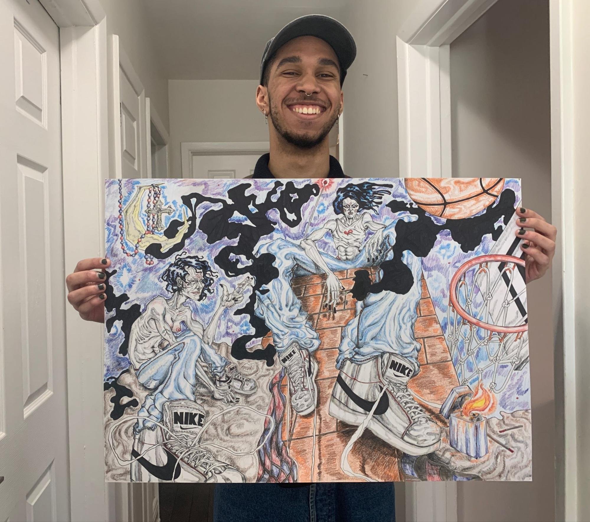
McKyle Byard, is holding a hand-drawn, unnamed piece of artwork created using pencil crayons, marker and pen. (Courtesy of McKyle Byard)

Championing his mistakes and creating art with his flaws, up-and-coming Canadian artist McKyle Byard blurs the lines between traditional and contemporary art forms.

Originally from Oakville, Ont., Byard began and grew his art career in Grade 6 when he was inspired by a classmate, taking stock of a variety of artistic interests until he discovered his unique personal style. Since then, Byard has explored many mediums, such as pen and pencil drawing, digital art, image collaging, 3D work, and Photoshop.

But he approaches art with a more abstract technique and doesn’t aim to depict an accurate representation of the real world. He emphasizes shapes, textures and other visual elements within his work and embraces each imperfection in what he calls his “ugly” art.

While some artists pursue perfection and strive to create a flawless representation of their vision, Byard doesn’t give himself any guidelines. The artist doesn’t conform to what society considers good and bad.

“I make my own rules,” said Byard. “I’m a big fan of not erasing. The marks you make are the marks you have to work with, and that creates a more personal and easily identifiable piece. It’s something that can’t be recreated by someone else.”

The artist appreciates when fellow creatives can express themselves how they see fit, and while guidelines can provide direction and structure, they can also be restrictive. Byard says he’s not afraid to incorporate mistakes and varying perspectives and experiences into his work.

Byard explains how his identity as a person of colour and a member of the queer community influences the art he creates. “I am not afraid to go crazy and go at it … Being a member of the LGBTQ+ community, you’re already judged from the get-go. Just let the ideas and your personality and expression flow out naturally”

He says imperfections can add depth and show character in someone’s art, making it more engaging. Rather than viewing mistakes as flaws that take away from the overall quality of work, they can be seen as a way to imbue it with personality.

By embracing those imperfections, people can look beyond the surface of a piece and connect with it on a deeper level, invoking the wide array of emotions that all art can produce.

While Byard waits for his breakthrough as an artist, he leaves himself open to any opportunity. He ideally sees himself in the future at a place where he can work for himself, one day fulfilling his dream to create a large, eye-catching mural.

The marks you make are the marks you have to work with, and that creates a more personal and easily identifiable piece. It’s something that can’t be recreated by someone else

“It would definitely be a fun, time-consuming thing to do. I can be anywhere in the future so long as I’m creating something with meaning and getting some kind of joy and fulfillment from that.”

Byard says he strives to depict freedom of expression in his artwork. “Don’t be afraid to do something ‘incorrect,’ and embrace that. Realize that that’s you and work with what you create. I’ve met a lot of artists who are so serious about being perfect. It’s a good skill to have, but for me, it takes the fun away,” he says.

One of the artist's least favourite parts about the vocation is the impostor syndrome, often doubting his accomplishments and feeling undeserving of his success.

“To get out of that bubble, you have to remind yourself to do what you do, for you. It will bring you fulfillment, and you joy. Other people enjoying it is just the bonus.”

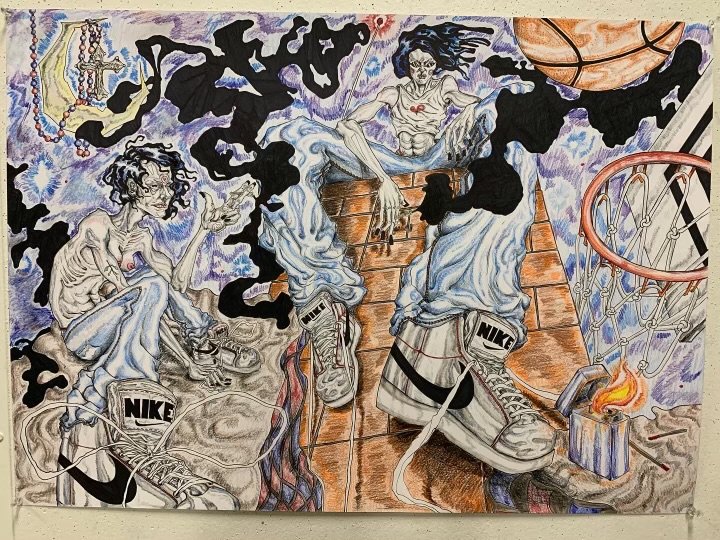
A close-up of a hand-drawn, unnamed piece of artwork using pencil crayon, marker and pen created by McKyle Byard. (Courtesy of McKyle Byard)

Byard’s current favourite piece is an unnamed drawing that depicts two friends unwinding by smoking weed.

“They’re essentially high, which is why [there’s] all that [wildness] around them, the sky is static, and I wanted to make the world look like it was warbling to show their distorted sense of mind.

“The piece doesn’t necessarily have a ‘meaning.’ It’s more so a scene that I wanted to illustrate, but in a way, you can feel a sense of friendship between the two.”

Byard’s love for this piece comes from the time he spent creating it. “It shows my style; it shows the ugly. I wasn’t really planning it out — I feel like it encapsulates my entire style in one piece.”

For other young BIPOC artists who hope to enter the art industry, Byard advises them to create art that represents their authentic selves. “Don’t take yourself so seriously; embrace your imperfections and make it a part of your style,” he says.

“Use it as a way to inspire … and appreciate the artists around you.”

Commuters turn to critics: Art on the TTC

Public art in the TTC works with local artists to bring creativity into Torontonians’ daily commutes

By: Calan Pittis and Hailey Ford

Red translucent glass mural with a silhouette of a commuter and a bench visible. Closed subway car doors in the background.

Zones of Immersion by Stuart Reid at Union Station in Toronto. (Edward Lander/CanCulture Magazine)

The Toronto Transit Commission (TTC) is home to dozens of public art installations that range in medium, scale and style, creating an opportunity for Torontonians to appreciate — and often critique — artwork as they bustle about their busy lives.

In an effort to incorporate more public art and to reduce vandalism within subway stations, the TTC created the TTC Public Art Program. The program, since its development in 2015, has allowed for the creation of seven works of art that would not otherwise exist. Not all public artwork in the TTC is a part of the program, with many pieces predating the initiative or being produced outside of it.

However, not every commuter is pleased with the artwork they see each day on their way to work.

The particularly controversial piece that has been a hot topic of discussion since its creation, titled Zones of Immersion, was created by London, Ont. artist Stuart Reid, and predates the program. The piece runs the length of the subway platform at Union Station, consisting of sketches of commuters blown up onto coloured glass, with fragments of poems overlayed on top.

Since it was unveiled in 2015, commuters of the TTC have had mixed feelings about Zones of Immersion, varying from concerns to criticisms to defences.

On his website, Reid points to Charles Dickens’ novels, distributed in newspapers, as inspiration. Reid sees both Zones of Immersion and Dickens’ novels as being for and reflective of the public. Both can also only be taken in at small intervals, yet form something larger.

The mural is still a topic of controversy today, with an online Reddit discussion with over 800 comments, detailing just how depressing people believe this piece to be.

“It makes the station, and the experience of the…thousands upon thousands of commuters who pass through it daily, definitely worse,“ wrote one Reddit user.

Critiques of the mural are mostly directed at the choice of location, given the theme of the art is often interpreted as a melancholy view of the commuting experience.

On the contrary, some commuters see value in the controversial subway mural. "I kind of like the work because it shows the reality of society," said Julius Manapul, an OCAD art professor, while commuting by subway.

Artwork in the TTC has been attracting recent attention from the negative sentiments directed towards the Union Station murals. Still, artists who have contributed work to the TTC, say public art in the subway can better the experience of commuters.

Rebecca Bayer

Subway station doors closing, with a portion of ceramic tile art visible in the background.

The Whole is Greater than the Sum of Its Parts by Rebecca Bayer at Sherbourne Station in Toronto. (Edward Lander/CanCulture Magazine)

Rebecca Bayer is the creator of The Whole Is Greater Than The Sum Of Its Parts, a collection of ceramic mosaics displayed at Sherbourne Station. The piece was created collaboratively, with each mosaic made by combining patterns devised by various community members who attended workshops hosted by Bayer.

“The name of the piece kind of says it all,” Bayer said. “Each person's contribution adds up to this greater sense of community within that area.”

Bayer discussed the need to have a variety of artwork on the TTC, allowing artists to express more serious themes.

“The intent of public art is not always to bring beauty. It could be something to think about or something to contemplate in a different way,” said Bayer. “Some artists have very challenging topics they are trying to get out there. They're trying to talk about personal issues or social issues or political issues, and I think that's all amazing.”

Katharine Harvey

Florae by Katharine Harvey at Chester Station in Toronto. (Edward Lander/CanCulture Magazine)

Katharine Harvey created the Florae mosaics, complementary and vivid additions to Chester Station on Line 2.

“My proposal was to reflect the native plant life in the area,” said Harvey. “Chester subway station might be the smallest subway on the whole line and it comes out into a residential area. I wanted to bring nature into the subway.”

Harvey spoke to the role of artists in bettering the commuting experience. “We're beautifying the stations so that it's not just drab subway tiles. [We’re] engaging the audience to think more about art and culture.”

Charles Pachter

Inside the subway station, six hockey players wearing jerseys and holding sticks are depicted in a mural on the wall.

Hockey Knights in Canada by Charles Pachter, displayed inside College Station in Toronto. (Edward Lander/CanCulture Magazine)

Hockey Knights in Canada by Toronto-based artist Charles Pachter, which has been on display since 1985, is one of the oldest and perhaps most well-known pieces of public art within the TTC.

“I used the primary colours, the red and the blue, the conservative and the liberal. There are so many different analogies for the imagery,” said Pachter. “Being able to work in that kind of a scale was terrific. It’s the only time I’ve ever done a mural like that.”

Pachter also spoke on the value of artwork in the subway system.

“It lightens people’s day. They get out, instead of seeing a blank wall or just an ad for shoes, they get to see a floor-to-ceiling image,” said Pachter.

Panya Clark Espinal

From Here Right Now by Panya Clark Espinal at Bayview Station in Toronto. (Edward Lander/CanCulture Magazine)

Canadian multi-media artist Panya Clark Espinal has done three pieces of public art for the TTC, which were created in the span of over a decade. Two of them can currently be seen inside subway stations — Spin at Downsview Park Station and From Here Right Now at Bayview Station, both utilizing unique perspectives to create optical illusions. The third piece, titled Generations, finds its home at a Streetcar stop on St. Clair Avenue West. 

“It’s kind of nice to make things that go out into the world and they stay out in the world,” said Espinal. “I did these anamorphic projection pieces because I felt that it was never going to lose its impact.”

As a long-time contributor to the program, Espinal said she has a lot of respect for the TTC Public Art Program.

“I think as human beings we need this stimulation. We need engagement with colour, with design, with materials that enliven the experiences of our day-to-day lives,” Espinal said. “Can we really imagine what our cities, our worlds would be if there was never any design element or public art?”